As summer begins in 2026, MakinaRocks is entering a new chapter.
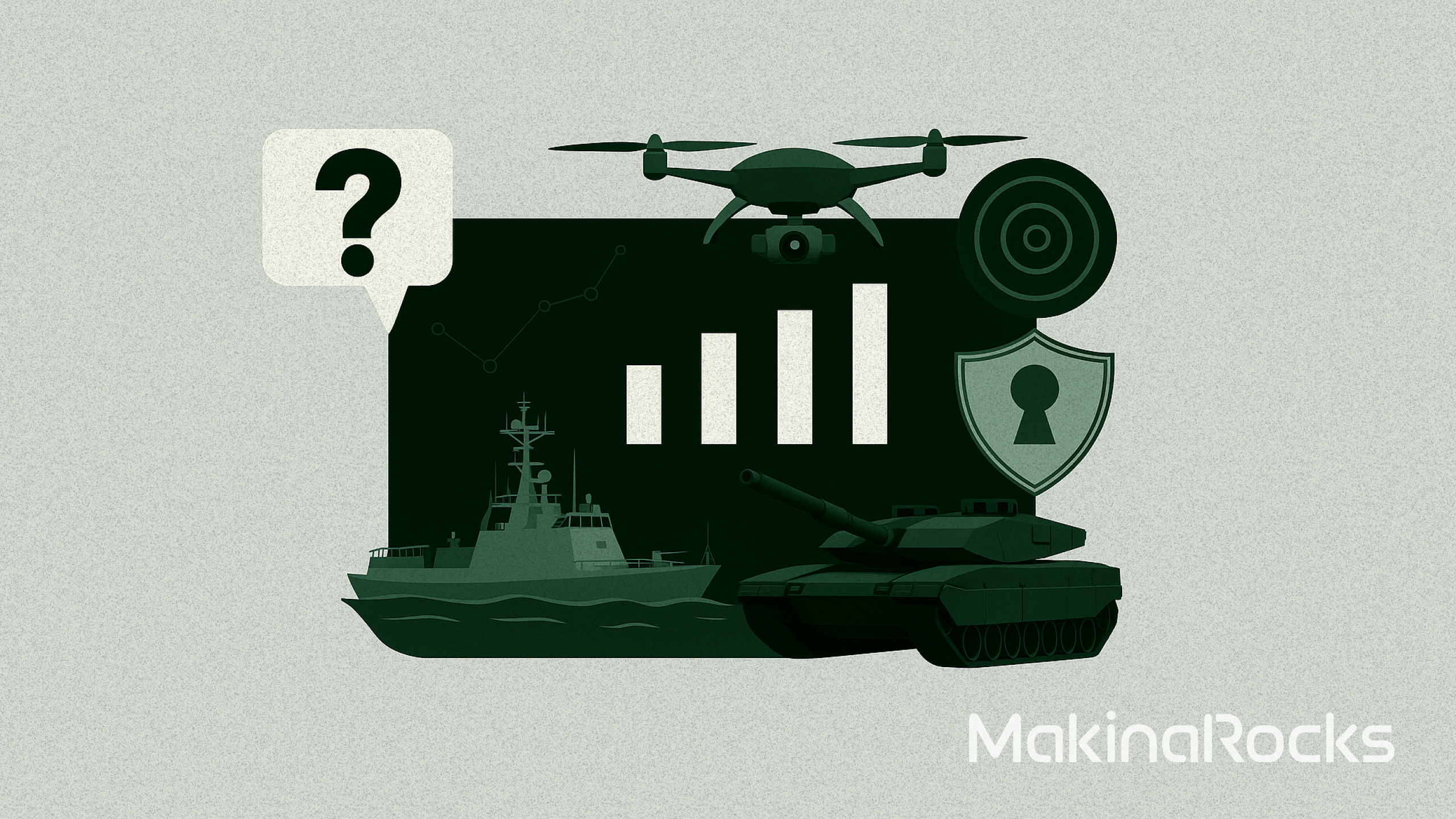
From factories to defense environments, we’ve spent years building AI for some of the world’s most harsh and unpredictable environments. Now, as we prepare to meet more customers, partners, and investors around the world, we felt it was time for our brand to evolve as well.
Today, we’re introducing a new logo and symbol for MakinaRocks.
Why we rebranded
Some questions follow a company for years. For us, it’s always been this one:
“Makina… what? MakinaRocks? What does the name even mean?”
It’s the question our team hears most. So here’s the answer — and the story behind a change that’s been a long time coming.
“Makina” comes from the Latin word for machine. “Rocks” comes from Rock ‘n’ Roll. Together, MakinaRocks means exactly what it sounds like: machine intelligence rocks.
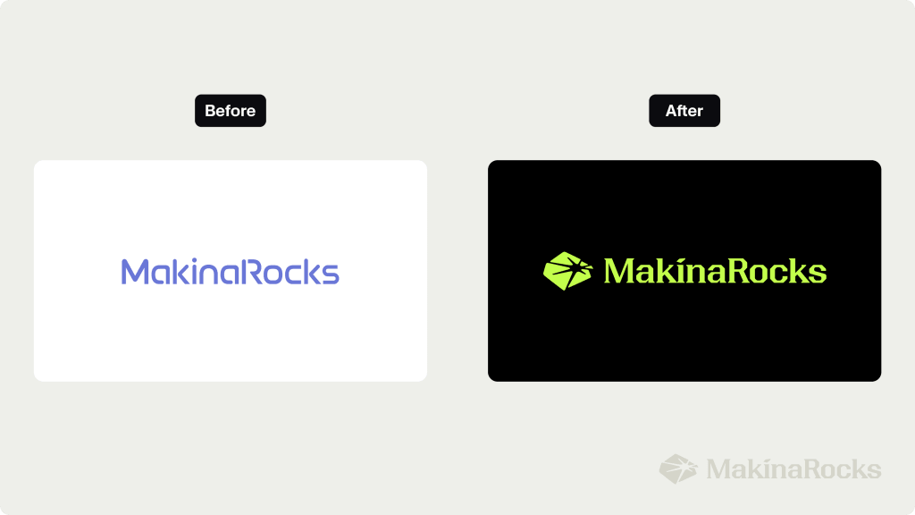
The idea has always been simple — AI powerful enough to reshape the world. The problem? The name is eleven letters long. For years, our logo was just the word “MakinaRocks” written in full. Honest and straightforward, but not always built for a world that moves fast.
As we expanded across products, events, and global markets, we kept asking ourselves the same question: could our brand become more immediate? More iconic? Could someone recognize us at a glance, before they’d even read the name?
The answer was obvious once we asked it. We were missing a symbol.
The explosive birth of AI
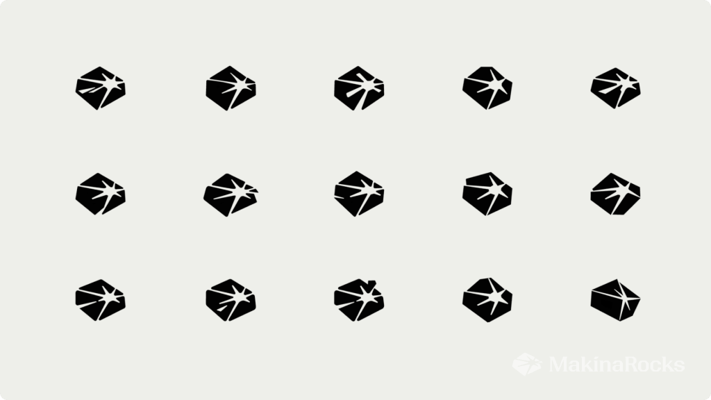
![]()
What was your first impression of the new symbol? Did it feel like something was about to break open — like enormous energy compressed into a single form? Good. That was intentional.
![[MakinaRocsk] FIELD-CORE-ROCKS](/wp-content/uploads/2026/05/rebranding-1024x353.png)
Every element of the symbol was designed to communicate something specific about who MakinaRocks is and where we operate. Here’s what it means.
A symbol for the real world
The outer shape represents the 🔗 Real World: the environments where our AI operates every day. Factories filled with noise and vibration. Defense systems where uncertainty is constant. Industrial infrastructure built up over decades. We wanted the symbol to feel dense and grounded — like a raw mineral, or a solid core under pressure. Because that’s where MakinaRocks exists. Not in controlled demos or isolated labs, but in the physical world, where AI has to perform under real conditions.
The moment potential breaks through
The lines expanding outward from the center represent the moment potential breaks through. They visualize the AI core inside MakinaRocks pushing past the constraints of industrial reality and expanding outward — into manufacturing, defense, public infrastructure, and global industries. The symbol is directional by design. It represents momentum, expansion, and a commitment to solving harder problems without slowing down.
A force that shatters industry boundaries
The force that breaks from the core doesn’t stay contained — it detonates outward. Across manufacturing floors, defense systems, public infrastructure, and industries we haven’t even reached yet. The symbol captures both meanings of “Rocks”: the verb, the act of shaking up the status quo, and the explosive expansion of what we call Hyperproductivity — our belief that AI should multiply human capability at industrial scale, not just automate tasks at the margins. And it represents something more: our commitment to keep moving forward, solving harder problems, never stopping. This isn’t incremental progress. It’s a rupture.
A new core color
We also introduced a new signature color: a fluorescent yellow-green that represents the energy of an activated AI core — breaking through rigid structures, igniting movement.
Against a deep black foundation, the contrast captures two forces that define MakinaRocks: stability and precision on one side, energy and acceleration on the other. We believe this color expresses our direction more clearly than anything we’ve used before.
Finding the most “MakinaRocks” form
The rebranding process wasn’t about chasing what looked current. It was about finding the most authentic expression of who we are.
We explored dozens of concepts along the way — AI as a solid system connecting the physical world, the core intelligence behind industrial transformation, AI as a kind of “Second Fire” for modern industry. Every idea was trying to answer the same question: how do you visually represent AI that’s built for reality?
The search kept returning to the same creative tension: the weight and complexity of industrial systems on one side, and the explosive energy of technological innovation on the other.
Once we found the right form — one that breaks through rigid boundaries and pushes forward — the refinement process became obsessive in the best way. Angles, curvature, visual balance, the vanishing point at the center — everything was adjusted through dozens of iterations until it felt exactly right.
The result is a symbol we’re proud to stand behind.
A new face, still becoming familiar
Honestly, it may feel unfamiliar at first. You may even prefer the old logo. That’s understandable. Familiarity is powerful. But the more we worked with the new symbol, the more it started to feel unmistakably like MakinaRocks.
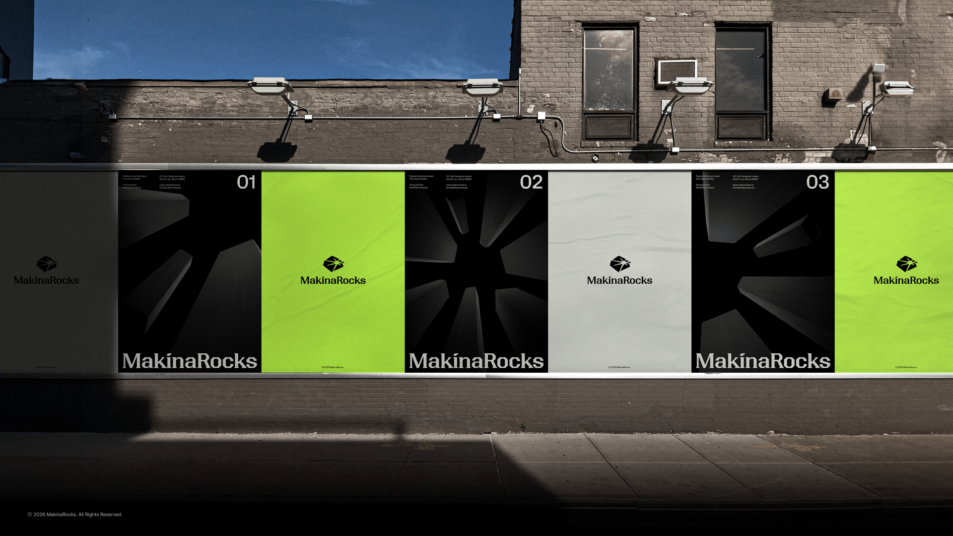
Not just a new logo — but a clearer expression of who we are becoming. We’re now applying the new logo and symbol across every touchpoint where MakinaRocks appears, including business cards, office spaces, digital channels, presentations, events, and product experiences. We’ve also rebuilt our broader design system around this new identity. It will take time before the symbol feels completely natural everywhere. But that process has already begun — and we’re excited for you to watch it evolve with us.
One-line summary: We have a symbol, we changed the logo, and we’re still shaking up the world. 🤘
Note: This post was translated from the original Korean version by Kyoungyeon Kim.